Flight Plotter
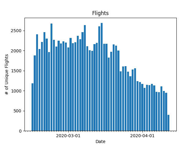
I started tracking flights in February of this year using PiAware. I soon after started logging the unique flights I capture every day, and updated a GitHub repo with the data every 12 hours. I didn’t do much with the data except look at it every once in a while just to see how many flights I had captured on certain days. Finally, I sat down today to write a quick Python script to plot the data in a bar chart format.

This was my first time ever creating graphs in Python, and I used matplotlib to assist me. It took me a little while to dial in my graph to only show the beginning of the months as the major tick, which involved formatting the dates from the filenames as a datetime object and using the dates package from matplotlib. The source code for the script can be found here. This is a very simple graph, for very simple data. I may look into storing more data in the future, but for now this will suffice.